
How to use ESLint to improve your workflow
ESLint ecosystem can be super handy for JS and TS codebases, but are you using it right? Keep reading to learn about useful ESLint rules and a get a little bit more out it.


How many times have you been aware of text's different shapes and sizes while browsing the web lately? Probably not many, unless you found an extremely uncomfortable typography that pushed you to quickly flee the website. Typography is a silent tool that UX designers and developers can sometimes take for granted. There is much noise around this topic. Pixels? Are breakpoints enough to switch sizes across devices? Do we even need breakpoints at all ? Let’s find out about a few key concepts to succeed at a responsive and accessible typography as a front-end developer or as a UX designer.
Readability and legibility are two typography concepts that relate to how easy it is to read a text. As readability can be more linked to implementation (such as font-size, line-height, amount of characters per line, etc.), legibility concerns mostly design choices (font type, weight or width among others). In this article we will focus on readability in order to achieve responsive and accessible typography.
There is an incredibly extended and wonderful documentation about typography, but readability sometimes-forgotten concepts can give some clues about responsiveness and accessibility.
The first readability factor to consider is the type size. The WCAG (Web Content Accessibility Guidelines) states that accessible text should be resizable up to 200 percent without loss of content or functionality.
Smaller text can be challenging for seniors, children or visually impaired people. Even if there is no official recommendation through this point nor WCAG directives, there is a growing consensus about body text being at least 16px.
For heavy-text pages, even 18px or >20px could even be suitable for a comfortable reading. Does it sound ridiculous? Check the body text on any medium.com article, such as this one.

Ok, what’s the trick here? Perhaps an intuitive answer to this question is to think that the text needs to be smaller to fit on the phone screen, or perhaps the opposite… that the text should be larger to achieve a more comfortable experience when reading on a smaller screen!
However, the answer is quite simple. The size of the font in the body of the text is usually the same on desktop, tablet or mobile. The companies that manufacture mobile devices have already solved this point by themselves. As front-end developers, our most critical practice is the way the font-size is implemented.
The px unit is a very popular unit in the front-end development world. Even if more often than not its use is accepted for font sizes in typographical hierarchies, it is not the way for creating a fully accessible body text in code. Users can change the default font value on the browser!
This is why body text has a better result when using the rem unit, which is relative to the font size of the root element. All major browsers set a default font size of 16px, so this is the value that developers use as reference in their CSS code.
What is the root element?
As the MDN documentation states, the root is the top-level element in an HTML document.
You probably know at this point that rem is not the only relative unit in CSS. There is also em units, which take the parent's font-size for calculating its value. Using rem is a more consistent approach for setting the size of your body text, since it has a fixed value that will scale predictably. I strongly recommend you to read this article about px and accessibility if you need to dive deeper in these waters.
There are a few different ways of implementing accessible font-size for body text. Take a few minutes to enumerate the possible ways this can be achieved. Did you think about tweaking the value from the HTML document?
/* Bad practice! It overrides any changes made by the user on the browser font-size. */
html {
    font-size: 16px;
}
This is a complete not-to-do. Applying a base font-size will override any change the user had done in the browser's settings. Maybe you have seen this trick that intends to make the math behind the usage of rem units easier by downsizing the equivalence of 1rem = 10px:
/* Not recommended! It breaks the by-default convention 1rem = 16px*/
html {
    font-size: 62.5%;
}
This practice has even been promoted by CSS-tricks last May on Twitter... and it received little love from their followers:
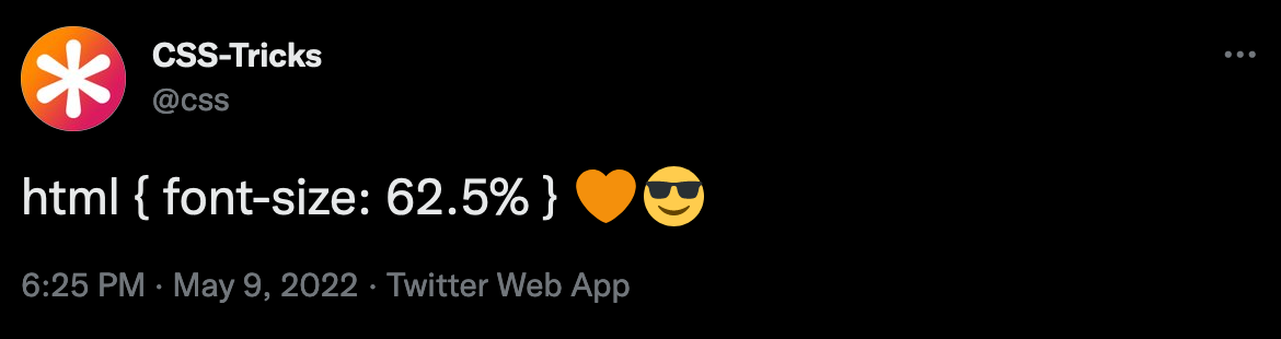
Changing the font size in the root is generally not great. It will either overwrite custom values or break any other usage of rem outside the typography. It is possible, but it will bring many changes regarding scalability.
Let's check a better way. Or two.

There's good news in this world of darkness. CSS has evolved through the years, and it has incorporated solving mathematical operations (+, -, /, *).
This CSS function takes a single expression as parameter and returns a value. The most powerful asset of calc() is the fact that it can mix different CSS units, and also supports CSS variables!.
calc() can come in handy when calculating typography size using rem units. It is possible to get the proportional value in a single line:
p {
    font-size: calc(18rem / 16);
}
Ok, this is quite practical. But you can take this magic to another level.
As Joshua W. Comeau wonderfully explains in his article "The Surprising Truth About Pixels and Accessibility", it is possible to take out the most of calc() by storing the calculated values in CSS variables.
What are CSS variables?
CSS variables are custom properties that store specific values that are reused several times through an app. They are written in a specific notation (e.g., font-size: --font-size-xs) and are accessed using the var() function.
html {
    --font-size-extra-small: 0.75rem; /* 12 px */
    --font-size-small: 0.875rem; /* 14 px */
    --font-size-normal: 1rem; /* 16 px */
    --font-size-large: 1.125rem; /* 18 px */
}
Yes, it is almost the same. But in terms of scalability and practicity, this approach has it all!

Fluid typography is a CSS enhancement that smoothly scales the font-size depending on the viewport width. In order to achieve this, a new CSS unit comes into play: vw units, which stands for viewport width.
Even if it is possible to make this happen using calc, it is better to use the CSS function clamp that takes three values:
This CSS function comes with two treats: it can solve operations without the use of calc and also allows mixing different CSS units, such as rem and vw.
h1 {
  font-size: clamp(
    1.5rem, /* min value: 24px */
    4vw + 1rem, /* preferred value: depends on the viewport width */
    3rem /* max value: 38px */
  );
How does this sorcery work? The vw unit is 1% of the viewport width, and the rem unit depends on the font-size set in the browser. For example, in an 800px width viewport, this value would be: 32 + 16 = 48px.
However, fluid typography should not replace responsive typography and it is not recommended for body text by many authors. On the other hand, headings are clear visual keys ordering content at a glance, and they are great candidates for using this technique. Headings are great, and they should not be underestimated.
Line height is also a key point in accessible typography. Just check this two paragraphs with the exact same content:
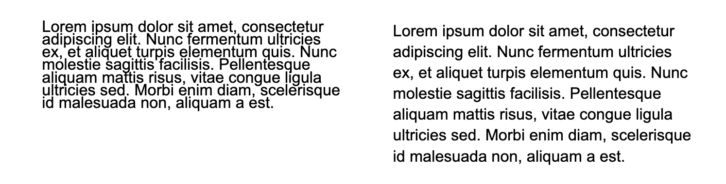
By default, most browsers set the line-height to 1.2. But what does 1.2 even mean? Spoiler: it's not pixels. An accessibility-focused line-height uses nothing less but unitless values (numbers) that are multiplied by the element's own font size. Yes, it is also possible to use percentages, em as well as global values, but this might lead to unexpected results.
Sometimes, the browsers' default values in properties such as line-height are just not great. The WCAG specifies that line-height should be 1.5 at least for body text, and this means that we should tweak this default value for ensuring accessibility.
body {
    line-height: 1.5; /* Safe path! */
}
This new setting works perfectly for body text, but gives a quite bizarre look to bigger texts such as headings. As shown in this amazing article, it might be possible to spare this problem using calc().
body {
    line-height: calc(
        2px + 2ex + 2px
    ); /* Experimental path! In this article https://www.joshwcomeau.com/css/custom-css-reset/#digit-tweaking-line-height, the author also suggests this other option:
    * {
  line-height: calc(1em + 0.5rem);
      }
*/
}
Please make sure to really test through your full app before considering it a victory! You can also use this very cool line-height calculator made by Fran Perez.
Another readability point is the line-length, or how many characters should you fit in one line. On this point, WCAG addresses a maximum of 80 characters per line. And yes, characters include white spaces. Unfortunately, this does not ensure a comfortable reading experience since there is still many factors to consider, such as the font type and the space between characters.
On the bright CSS side, there's another unit that can help with this subject: ch. As MDN states here, ch is an advanced measure (width) of the glyph "0" of the element's font. Along with max-width, it is possible to set an amount of maximum space available for each character:
p {
    max-width: 50ch; /* This is an example. You will need to adjust this number depending on the chosen font */
}
The magic range to aim here is between 50 - 75 characters per line. Ignoring this point has many negative effects and especially troubles vision impaired or dyslexic people. Users will not engage with the content or might even not be able to access important information such as FAQs.
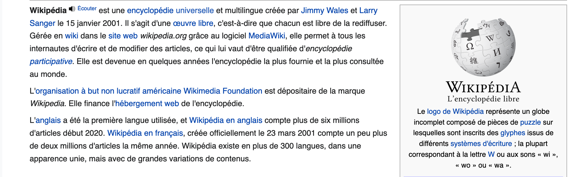
Wikipedia is a great (bad) exemple. Even using a way greater amount of characters than recommended, the difference is easily visible in this two extraits:

Let's jump to the last readability point of this article!
High contrast between the font and the background ensure good readability. This is a quite basic concept and might even feel like an intuitive principle. Nevertheless, it still happens (quite often).
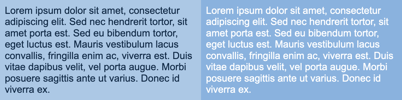
Do you think both texts have enough contrast?
In fact, no. The text on the left has a score of 8.21 with a very good rating, meanwhile the text on the right has a score of 2.21 points - which means it is not even enough for the minimum contrast ratio asked by WCAG (4:5:1 for normal text).
This might be good advice for designers: it is worth taking some time to check the contrast ratio when choosing an app's palette (especially on font colors!). Fortunately, there is plenty of tools that make this job way easier, such as coolors.co and webaim.org.
Web typography is a beautiful and a little bit messy world. In this article we just merely saw the basics of how we can set strong basis on our code and design in order to have the best possible result. There might be a ton of other techniques and points that could not fit in a single blog entry. People even wrote books about it (e.g.: On web typography by Jason Santa Maria) and you can even read this case study about it.
From my point of view, it is a responsability as creators to care about having inclusive products. Even if accessibility is a wide topic and we can struggle putting all its principles in practice, I think this can be a good start. Caring is always the first step.

Author(s)
Maria Eugenia Trapani
Dev Front-End & SEO enthousiast
You wanna know more about something in particular?
Let's plan a meeting!
Our experts answer all your questions.
Contact usDiscover other content about the same topic
ESLint ecosystem can be super handy for JS and TS codebases, but are you using it right? Keep reading to learn about useful ESLint rules and a get a little bit more out it.